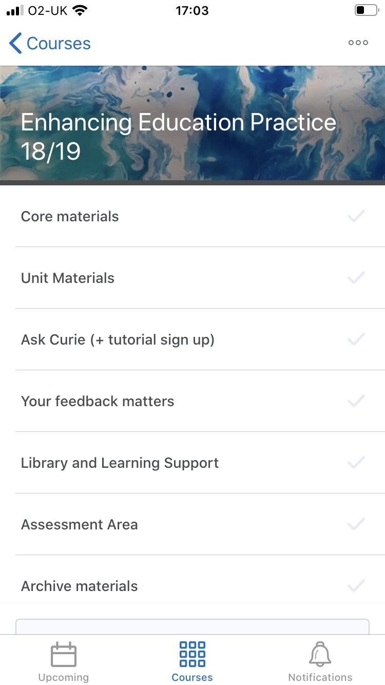
Brightspace viewed on a mobile phone screen
Mobile devices provide students with the flexibility to access their learning as and when they require it and data shows that people are accessing their mobile phones up to 10 times every hour. So it’s important to consider how to deliver a quality Brightspace experience on smaller screens.
Brightspace provides mobile access via the Pulse app where students can access course content online or offline, see their latest grades, view course announcements or seamlessly log into Brightspace via their browser. Brightspace’s responsive design means it’s already optimised to work on any device with the layout adjusting automatically to the size of the screen it is being viewed on. For example, there will be no horizontal scrolling when viewed on a mobile phone.
It would be unrealistic to expect all your unit content to be accessed via mobile devices, especially as the average session time on mobiles is just 10 minutes, but with that in mind it’s worth thinking about how you can optimise your units for mobile delivery.
Scaffolding your unit
Your unit structure should be clear and unambiguous, in a weekly or topic format, making it intuitive to navigate. This will help make content easy to find on a small screen and provide a natural flow through the learning materials.
Clear labelling
Aim for clear and consistent labelling of all modules and files, including lecture recordings. Clear headings make it easy to scan through on a mobile device. Use the Descriptions field to add context to learning materials; explain why it’s there and what it’s for.
Minimise the click count
Put the most important information at the top level. Content should be organised to no more than 3 levels deep; top level, module and sub module. Use QuickLinks in areas such as Announcements so that students can dive straight to the content they need. Or consider releasing content in stages using Release conditions so that students aren’t overwhelmed with content.
Chunk it up
Micro or bitesize learning works well on any device, especially when learning remotely, so chunk learning up into key digestible topics. This will be easier to access from a mobile device, is a great tool for revision and makes for a more dynamic learning experience for all.
Keep it visual
Aim for a clean screen that is easy to read and not text heavy. Video is a simple and effective way to communicate with students and works well on mobile devices. And recording a short Video Note can relay more content than a long written communication. For longer videos (more than 5 minutes) Panopto is recommended as the quality of the video is optimised for the end user’s device and connection speed.
Quality images
Graphics need to be clear and simple as detail can be lost on small screens. Avoid complicated, heavily labelled diagrams or screen grabs and be aware of extended loading times for very large files.
Keep it interactive
Mobile devices are ideal for completing short formative quizzes on the go, or for accessing online polls and surveys, so plan for interactive activities to foster student engagement in learning.
If you want to check how your unit will look on a smaller screen, you can always reduce the size of the browser window on your screen on your laptop or PC by dragging the corner in. You’ll see how Brightspace automatically scales its layout for the smaller screen. Doing this with ‘View as student’enabled will give a closer simulation and will probably be reassuring as the student view is simpler than the staff view! Alternatively, just access Brightspace from the browser on your phone or tablet.
Clearly these tips aren’t really mobile specific; they’re just good practice in learning design for any device. But ensuring you provide accessible content means you are providing an inclusive and consistent experience for everyone.
Further resources:
Hill, D. Mobile learning design strategy: why it matters and how to get the best results for your learners
https://www.elucidat.com/blog/mobile-learning-design-strategies/


